
Widget Templates
Persistent widgets live on the Home Screen, the Lock Screen, StandBy, and the
Apple Watch. Unlike Live Activities, they are not tied to an ongoing activity:
you create a widget once in the app, picking its template and slug, then
update its content whenever you like via the
API, and Aivi pushes the change to every
device that displays it.
Choosing a template
Section titled “Choosing a template”Ten templates cover the common shapes of glanceable data. Pick the one that matches yours; each card jumps to the template’s schema and examples.
The content object you send
must match the widget’s template schema. Widget
templates reuse the Live Activity building blocks (
colors, icons,
values, and
formatters), so the vocabulary is the same across
both.
Every template renders at every Home Screen size, small through extra large, on the Lock Screen, and on the Apple Watch. The data-rich templates put the larger canvases to work with more data; the simpler ones scale to fit.
Freshness
Section titled “Freshness”Widgets are Aivi’s persistent, best-effort layer. Knowing how updates travel helps you pick the right tool:
- Content pushes arrive in minutes, not seconds. Updating a widget stores the content and sends a low-priority background push to every device showing it. iOS batches and budgets these pushes to save battery, so a change typically appears within minutes: often faster, occasionally slower (Low Power Mode, a sleeping device). Design for “latest known state”, not for real-time.
- Predictable data stays live without pushes. Anything the device can
compute on its own keeps ticking between pushes: the
Progress template’s
end_datecountdown and self-advancing bar, the Countdown target, thetime_since/time_untilformatters, and the Prices timeline highlighting the current period. One push can keep a widget correct for hours or days; prefer this over frequent pushes. - Real-time belongs to Live Activities. If you need second-by-second updates during an ongoing task, use a Live Activity: that is the layer iOS budgets for real-time. A widget can sit alongside it as the persistent summary.
Marking content as stale
Section titled “Marking content as stale”By default a widget shows its last content indefinitely, with no judgement
about age; only you know your update cadence. Set stale_after (in seconds)
to opt in to staleness: once the content is older than the threshold, the
widget visually demotes it and shows an “as of 14:32” line instead of
presenting old data as current. You can set it when creating the widget in
the app, or per request via the API.
Status Template
Section titled “Status Template”ID: status
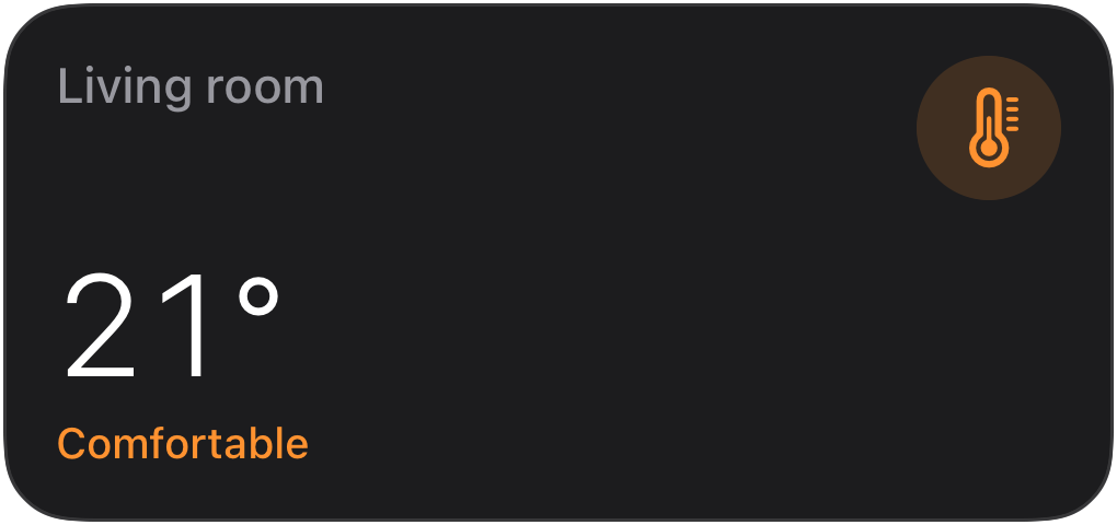
At-a-glance state: an icon, a hero reading, and a state line.
Home Assistant
Section titled “Home Assistant”Use the Home Assistant blueprint to keep a Status widget in sync with your sensors.

API schema
Section titled “API schema”| Field | Type | Description | Required? |
|---|---|---|---|
template | "status" | Identifies this template. | Yes |
value | Value | The hero reading. Supports text colors and the self-ticking time_since / time_until formatters. When absent, the state takes its place. | No |
state | Value | The supporting line under the hero. | No |
icon | string | Icon | An SF Symbols icon name or an Icon with rendering options. | No |
accent | Color | Palette color that themes the whole widget. Falls back to the icon color. | No |
tap_url | string | Tap action URL to open when the widget is tapped. | No |
Example payload
Section titled “Example payload”{ "template": "status", "value": { "value": "21°" }, "state": { "value": "Comfortable", "text_color": "green" }, "icon": { "name": "thermometer.medium", "primary_color": "orange" }}Progress Template
Section titled “Progress Template”ID: progress
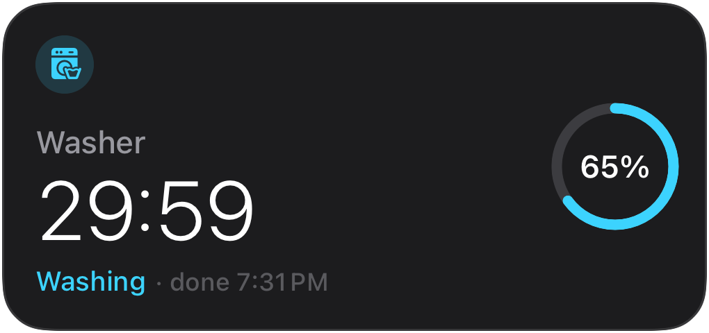
A live progress bar or countdown. With an end_date set, a single push keeps
the widget counting down and the bar advancing on its own.
Home Assistant
Section titled “Home Assistant”Use the Home Assistant blueprint to keep a Progress widget in sync with your sensors.
API schema
Section titled “API schema”| Field | Type | Description | Required? |
|---|---|---|---|
template | "progress" | Identifies this template. | Yes |
progress | ProgressBar | Progress bar configuration: a simple single-color bar or a segmented bar. | Yes |
state | Value | The state line (for example “Washing”). | No |
end_date | string | ISO 8601 timestamp. When set in the future, the widget shows a live countdown and, for simple bars, a self-advancing bar, with no extra pushes needed. Segmented bars stay static. | No |
icon | string | Icon | An SF Symbols icon name or an Icon with rendering options. | No |
accent | Color | Palette color that themes the whole widget. Falls back to the icon color. | No |
tap_url | string | Tap action URL to open when the widget is tapped. | No |
Example payload
Section titled “Example payload”{ "template": "progress", "progress": { "style": "simple", "value": 0.65, "color": "cyan" }, "state": { "value": "Washing" }, "end_date": "2026-07-01T15:42:00Z", "icon": { "name": "washer.fill", "primary_color": "cyan" }}Gauge Template
Section titled “Gauge Template”ID: gauge
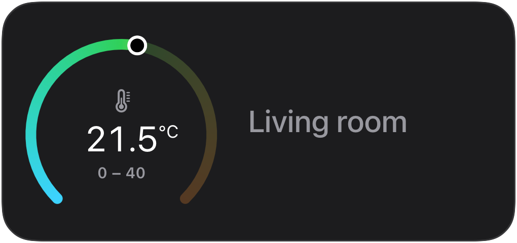
A numeric reading on an instrument dial.
Home Assistant
Section titled “Home Assistant”Use the Home Assistant blueprint to keep a Gauge widget in sync with your sensors.
API schema
Section titled “API schema”| Field | Type | Description | Required? |
|---|---|---|---|
template | "gauge" | Identifies this template. | Yes |
value | float | The reading. | Yes |
min_value | float | Dial minimum. Default: 0. | No |
max_value | float | Dial maximum. Default: 1. | No |
unit | string | Unit shown with the reading (for example "°C"). | No |
label | string | Label shown with the reading (for example "Living room"). | No |
color | Color | Solid dial color. | No |
gradient | Color[] | 2–4 gradient stops for the dial. | No |
icon | string | Icon | An SF Symbols icon name or an Icon with rendering options. | No |
accent | Color | Palette color that themes the whole widget. Falls back to the icon color. | No |
tap_url | string | Tap action URL to open when the widget is tapped. | No |
Example payload
Section titled “Example payload”{ "template": "gauge", "value": 21.5, "min_value": 0, "max_value": 40, "unit": "°C", "label": "Living room", "icon": { "name": "thermometer.medium" }}Battery Template
Section titled “Battery Template”ID: battery
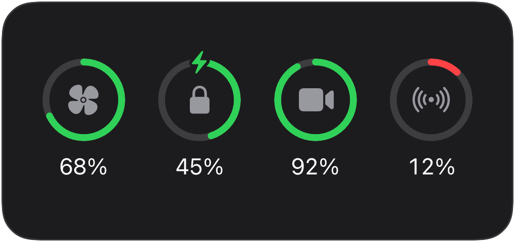
Device battery levels in Apple’s Batteries idiom: level rings with device icons, and a device list at the large sizes. Made for home-automation devices (vacuums, locks, cameras, sensors) that Apple’s own widget cannot show.
Home Assistant
Section titled “Home Assistant”Use the Home Assistant blueprint to keep a Battery widget in sync with your sensors. Requires Home Assistant 2025.7 or newer.
API schema
Section titled “API schema”| Field | Type | Description | Required? |
|---|---|---|---|
template | "battery" | Identifies this template. | Yes |
devices | Device[] | 1–8 devices, shown in the order you send them. Small and medium show up to four rings; large lists up to eight devices. | Yes |
icon | string | Icon | An SF Symbols icon name or an Icon with rendering options. | No |
accent | Color | Palette color that themes the whole widget. Falls back to the icon color. | No |
tap_url | string | Tap action URL to open when the widget is tapped. | No |
Device object
Section titled “Device object”| Field | Type | Description | Required? |
|---|---|---|---|
name | string | Device name, shown in the large list. | Yes |
level | float | Battery percentage, 0–100. | Yes |
charging | bool | Adds the charging bolt. Default: false. | No |
icon | string | Icon | Symbol shown inside the ring. | No |
color | Color | Ring color override. By default rings are green, or red at 20 percent and below. | No |
Example payload
Section titled “Example payload”{ "template": "battery", "devices": [ { "name": "Robot vacuum", "level": 68, "icon": "fan.fill" }, { "name": "Door lock", "level": 45, "charging": true }, { "name": "Doorbell cam", "level": 92, "icon": "video.fill" } ]}Budget Template
Section titled “Budget Template”ID: budget
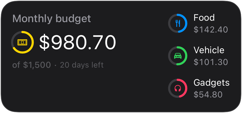
A top-level budget plus up to six category breakdowns, made for finance and budgeting. Renders at the large widget sizes too.
Amounts are structured money, not preformatted strings: send numbers or decimal strings, and the device formats them for the user’s locale and the given currency (symbol placement, grouping, and fraction digits, so JPY gets 0 and USD gets 2). Prefer decimal strings: a JSON number cannot carry a trailing zero.
Home Assistant
Section titled “Home Assistant”Use the Home Assistant blueprint to keep a Budget widget in sync with your sensors. Requires Home Assistant 2025.7 or newer.
API schema
Section titled “API schema”| Field | Type | Description | Required? |
|---|---|---|---|
template | "budget" | Identifies this template. | Yes |
total | Entry | The top-level budget line. The widget name serves as its label. | Yes |
categories | Entry[] | Up to 6 category lines, shown in the order you send them. | No |
currency | string | ISO 4217 code (3 uppercase letters); one currency per widget. | Yes |
display | "remaining" | "spent" | Which figure headlines everywhere; the ring follows it, so remaining mode drains toward empty while spent mode fills up. Overspending shows a negative remainder in red. Default: "remaining". | No |
subtitle | Value | Shown with the total, for example “20 days left”. Supports the time_until formatter for a self-updating line. | No |
icon | string | Icon | An SF Symbols icon name or an Icon with rendering options. | No |
accent | Color | Palette color that themes the whole widget. | No |
tap_url | string | Tap action URL to open when the widget is tapped. | No |
Budget entry
Section titled “Budget entry”| Field | Type | Description | Required? |
|---|---|---|---|
spent | number | string | Amount spent. | Yes |
budget | number | string | Budgeted amount, greater than 0. When present the entry gets a progress ring and the total shows an “of $1,500” line. When absent the entry shows the spent amount with a plain icon. | No |
label | string | The category name. | No |
icon | string | Icon | An SF Symbols icon name or an Icon with rendering options. | No |
color | Color | The ring color. Falls back to the icon color, then the accent. | No |
Example payload
Section titled “Example payload”{ "template": "budget", "currency": "USD", "display": "remaining", "total": { "spent": "519.30", "budget": "1500", "icon": { "name": "banknote", "primary_color": "yellow" }, "color": "yellow" }, "subtitle": { "value": "20 days left" }, "categories": [ { "spent": "157.60", "budget": "300", "label": "Food", "icon": "fork.knife", "color": "blue" } ]}Trend Template
Section titled “Trend Template”ID: trend
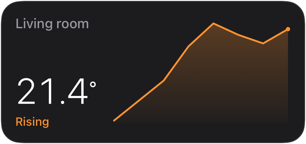
A current reading with a compact history sparkline: temperature, humidity, power draw, or anything you already track as a series. You post the recent history; the device draws and scales the chart. Renders at the large widget sizes too.
Home Assistant
Section titled “Home Assistant”Use the Home Assistant blueprint to keep a Trend widget in sync with your sensors.
API schema
Section titled “API schema”| Field | Type | Description | Required? |
|---|---|---|---|
template | "trend" | Identifies this template. | Yes |
value | float | The current reading, shown as the hero. | Yes |
points | float[] | Recent history, 2–48 points, oldest first. The device scales the sparkline to the data. | Yes |
unit | string | Unit shown with the reading (for example "°"). | No |
min_value | float | Fixed lower chart bound. Unset scales to the data. | No |
max_value | float | Fixed upper chart bound. Unset scales to the data. | No |
state | Value | Supporting line under the hero (for example “Rising”). | No |
color | Color | Sparkline color. Falls back to the accent, then the icon color. | No |
icon | string | Icon | An SF Symbols icon name or an Icon with rendering options. | No |
accent | Color | Palette color that themes the whole widget. Falls back to the icon color. | No |
tap_url | string | Tap action URL to open when the widget is tapped. | No |
Example payload
Section titled “Example payload”{ "template": "trend", "value": 21.4, "unit": "°", "points": [18.2, 18.9, 19.6, 20.8, 21.6, 21.2, 20.9, 21.4], "state": { "value": "Rising" }, "icon": { "name": "thermometer.medium", "primary_color": "orange" }}Countdown Template
Section titled “Countdown Template”ID: countdown
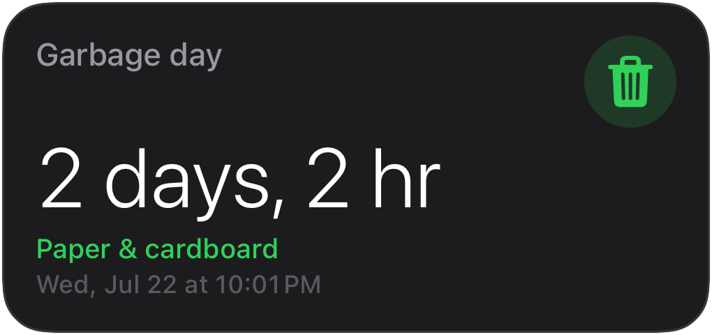
A moment in time rendered as a self-updating countdown: garbage day, the next departure, an appliance finishing. One push sets the target; the device keeps the countdown current with no further pushes.
Home Assistant
Section titled “Home Assistant”Use the Home Assistant blueprint to keep a Countdown widget in sync with your sensors.
API schema
Section titled “API schema”| Field | Type | Description | Required? |
|---|---|---|---|
template | "countdown" | Identifies this template. | Yes |
target | string | ISO 8601 timestamp (with timezone) to count down to. | Yes |
subtitle | Value | Supporting line (for example “Paper & cardboard”). | No |
expired_text | string | Shown once the target has passed. Without it, the widget shows the time elapsed since the target instead. | No |
icon | string | Icon | An SF Symbols icon name or an Icon with rendering options. | No |
accent | Color | Palette color that themes the whole widget. Falls back to the icon color. | No |
tap_url | string | Tap action URL to open when the widget is tapped. | No |
Example payload
Section titled “Example payload”{ "template": "countdown", "target": "2026-07-04T06:30:00Z", "subtitle": { "value": "Paper & cardboard" }, "expired_text": "Out now", "icon": { "name": "trash.fill", "primary_color": "green" }}List Template
Section titled “List Template”ID: list
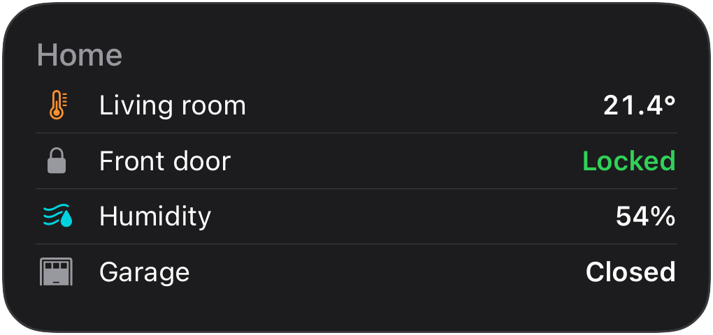
Rows of labeled values: the generic multi-entity readout for anything that does not fit a more specific template. Small and medium show up to four rows (small drops the labels to fit); large lists up to eight. Renders at the large widget sizes too.
Home Assistant
Section titled “Home Assistant”Use the Home Assistant blueprint to keep a List widget in sync with your sensors. Requires Home Assistant 2025.7 or newer.
API schema
Section titled “API schema”| Field | Type | Description | Required? |
|---|---|---|---|
template | "list" | Identifies this template. | Yes |
rows | Row[] | 1–8 rows, shown in the order you send them. | Yes |
icon | string | Icon | An SF Symbols icon name or an Icon with rendering options. | No |
accent | Color | Palette color that themes the whole widget. Falls back to the icon color. | No |
tap_url | string | Tap action URL to open when the widget is tapped. | No |
Row object
Section titled “Row object”| Field | Type | Description | Required? |
|---|---|---|---|
label | string | The row label. | Yes |
value | Value | Trailing value, with optional text color and formatters. | No |
icon | string | Icon | Leading symbol. | No |
Example payload
Section titled “Example payload”{ "template": "list", "rows": [ { "label": "Living room", "value": { "value": "21.4°" }, "icon": { "name": "thermometer.medium", "primary_color": "orange" } }, { "label": "Front door", "value": { "value": "Locked", "text_color": "green" }, "icon": "lock.fill" }, { "label": "Humidity", "value": { "value": "54%" }, "icon": { "name": "humidity.fill", "primary_color": "teal" } } ]}Prices Template
Section titled “Prices Template”ID: prices
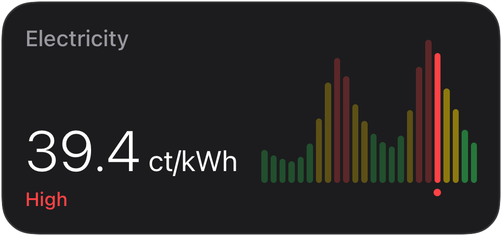
A price timeline for dynamic tariffs: hourly electricity prices and the like. Post the periods you know (for example today plus tomorrow, hourly); the device charts them and highlights the current one, so a single nightly push stays correct all day. Renders at the large widget sizes too.
Home Assistant
Section titled “Home Assistant”Use the Home Assistant blueprint to keep a Prices widget in sync with your sensors.
API schema
Section titled “API schema”| Field | Type | Description | Required? |
|---|---|---|---|
template | "prices" | Identifies this template. | Yes |
entries | Entry[] | 1–48 pricing periods in strictly increasing start order. Each period lasts until the next one begins. | Yes |
unit | string | Display unit (for example "ct/kWh"); prices are unit-agnostic numbers. | No |
icon | string | Icon | An SF Symbols icon name or an Icon with rendering options. | No |
accent | Color | Palette color that themes the whole widget. Falls back to the icon color. | No |
tap_url | string | Tap action URL to open when the widget is tapped. | No |
Price entry
Section titled “Price entry”| Field | Type | Description | Required? |
|---|---|---|---|
start | string | ISO 8601 timestamp the period starts at. | Yes |
price | float | The price for the period. | Yes |
level | "low" | "medium" | "high" | Explicit price banding. Unset lets the device derive bands from the posted range. | No |
Example payload
Section titled “Example payload”{ "template": "prices", "unit": "ct/kWh", "entries": [ { "start": "2026-07-02T00:00:00+02:00", "price": 14.2 }, { "start": "2026-07-02T01:00:00+02:00", "price": 12.8 }, { "start": "2026-07-02T02:00:00+02:00", "price": 11.9, "level": "low" }, { "start": "2026-07-02T03:00:00+02:00", "price": 22.4 } ]}Energy Template
Section titled “Energy Template”ID: energy
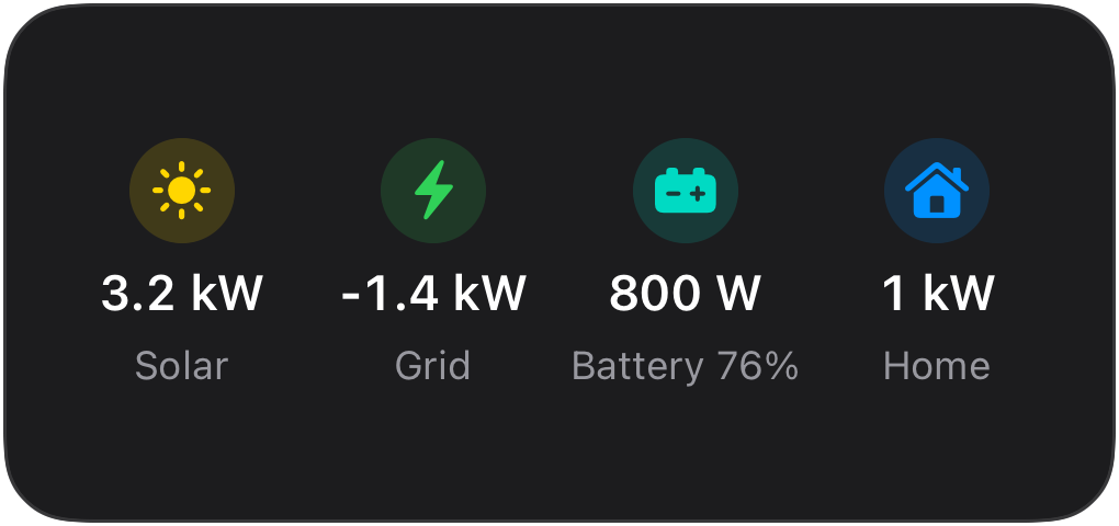
Home energy at a glance: generation sources, grid, battery, and home consumption. Sources are generation of any kind (solar, wind, hydro, a generator) and default to the solar presentation when unnamed. Renders at the large widget sizes too.
Home Assistant
Section titled “Home Assistant”Use the Home Assistant blueprint to keep a Energy widget in sync with your sensors. Requires Home Assistant 2025.7 or newer.
API schema
Section titled “API schema”| Field | Type | Description | Required? |
|---|---|---|---|
template | "energy" | Identifies this template. | Yes |
sources | Node[] | Up to 3 generation sources. | No |
grid | Node | The grid connection. | No |
battery | Node | The home battery. | No |
home | Node | Home consumption. | No |
icon | string | Icon | An SF Symbols icon name or an Icon with rendering options. | No |
accent | Color | Palette color that themes the whole widget. Falls back to the icon color. | No |
tap_url | string | Tap action URL to open when the widget is tapped. | No |
Energy node
Section titled “Energy node”All four slots share this one node shape; the slot a node sits in decides
its defaults and how its power sign is read. In practice level belongs
to the battery node and name chiefly renames generation sources; the
remaining fields apply everywhere.
| Field | Type | Description | Required? |
|---|---|---|---|
name | string | Display label overriding the slot’s default (“Solar”, “Grid”, …); chiefly for generation sources (“Wind”, “Hydro”). | No |
power | float | Instantaneous power in watts. The sign follows the slot’s convention (see above). | Yes |
today | float | Today’s cumulative energy in kWh. | No |
level | float | Charge percent (0–100); battery node only. | No |
icon | string | Icon | Symbol for the node. | No |
color | Color | Color override for the node. | No |
Example payload
Section titled “Example payload”{ "template": "energy", // Unnamed sources render as "Solar"; set "name" for "Wind", "Hydro", … "sources": [{ "power": 3200, "today": 12.4 }], // Negative grid power: exporting. Positive would be importing. "grid": { "power": -1400, "today": 3.1 }, // Positive battery power: charging. Negative would be discharging. "battery": { "power": 800, "level": 76 }, "home": { "power": 1000, "today": 9.8 }}Publishing from Home Assistant
Section titled “Publishing from Home Assistant”The quickest path is the ready-made widget blueprints: one per template, imported in a few clicks, with the payload plumbing handled for you.
For anything the blueprints don’t cover, widgets use the same
RESTful command
pattern as Live Activities. Add a command for the
widget endpoint to configuration.yaml:
rest_command: update_widget: url: "https://api.getaivi.app/widget/{{ slug }}" method: PATCH headers: content-type: application/json authorization: Token [token] payload: "{{ payload }}"Then call it from an automation whenever the source data changes. This example keeps a Gauge widget in sync with a temperature sensor:
- triggers: - trigger: state entity_id: sensor.living_room_temperature actions: - action: rest_command.update_widget data: slug: living-room payload: >- { "content": { "template": "gauge", "value": {{ states('sensor.living_room_temperature') | float(0) }}, "min_value": 10, "max_value": 35, "unit": "°C", "label": "Living room", "icon": "thermometer.medium" } }There is no need to update on a timer: widgets show the latest known state, so updating only when the value actually changes is enough. For slow-moving data (battery levels, prices), a time-pattern trigger every hour or a single nightly update works just as well.
Publishing from Shortcuts
Section titled “Publishing from Shortcuts”Shortcuts can update a widget when run manually, from the Action button, or on a schedule via a personal automation, no server required.
-
Add a Text action containing the request body:
{"content": {"template": "progress","progress": { "style": "simple", "value": 0.6, "color": "cyan" },"state": { "value": "1.5 of 2.5 L" },"icon": { "name": "drop.fill", "primary_color": "cyan" }}}Build the dynamic parts (numbers, dates) with earlier Shortcuts actions and insert them into the Text as variables.
-
Add a Get Contents of URL action pointing at
https://api.getaivi.app/widget/water-intakeand expand Show More:- Method:
PATCH - Headers:
Authorization→Token YOUR_API_TOKENandContent-Type→application/json - Request Body: File, set to the Text from step 1
- Method:
-
Run the shortcut. The widget updates on every device that shows it.
For the full endpoint reference (request body, stale_after, responses, and
errors), see Update a widget in the API
reference.