Templates
A template decides what a Live Activity looks like on the device. To see these templates in real scenarios, with full payloads, browse the use cases.
Progress Template New
Section titled “Progress Template ”ID: progress
The progress template is a flexible way to visualize any progress-based activity. It supports simple single-color bars, multi-segment bars with individual colors, and two display modes for segmented bars.
Home Assistant
Section titled “Home Assistant”Use the Home Assistant blueprint to get started quickly with the Progress template.
Two more blueprints are available for segmented bars and timer-driven progress. See the blueprints page for the full list.
API schema
Section titled “API schema”| Field | Type | Description | Required? |
|---|---|---|---|
template | "progress" | Identifies this template. | Yes |
progress | ProgressBar | Progress bar configuration. | Yes |
icon | string | Icon | An SF Symbols icon name or an Icon with rendering options. | No |
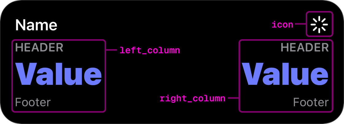
header_left | Value | Left header slot. | No |
header_right | Value | Right header slot. | No |
footer_left | Value | Left footer slot. | No |
footer_right | Value | Right footer slot. | No |
compact_value | Value | Value shown in Dynamic Island compact trailing. | No |
tap_url | string | Tap action URL to open when tapped. | No |
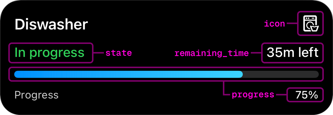
To get a better understanding of how this schema correlates to a displayed live activity, see the picture below:
Progress bar
Section titled “Progress bar”The progress field accepts two styles, distinguished by the style key.
Simple
Section titled “Simple”A single-color bar.
| Field | Type | Description | Required? |
|---|---|---|---|
style | "simple" | Identifies this style. | Yes |
value | float | Progress in range [0.0–1.0]. | Yes |
color | Color | Bar fill color. | No |
Segmented
Section titled “Segmented”A bar split into labeled sections with individual colors.
| Field | Type | Description | Required? |
|---|---|---|---|
style | "segmented" | Identifies this style. | Yes |
value | float | Overall progress in range [0.0–1.0]. | Yes |
segments | Segment[] | 1–4 segments. Values must sum to 1.0. | Yes |
display | "split" | "layered" | How segments are rendered. Default: "split". | No |
Segment object
Section titled “Segment object”| Field | Type | Description | Required? |
|---|---|---|---|
value | float | Fraction of the bar this segment occupies. | Yes |
fill_color | Color | Color when filled. | Yes |
track_color | Color | Unfilled track color. | No |
track_fill | "solid" | "hatched" | Track pattern. Default: "solid". | No |
label | string | Label shown below the segment. | No |
Example payloads
Section titled “Example payloads”Simple bar:
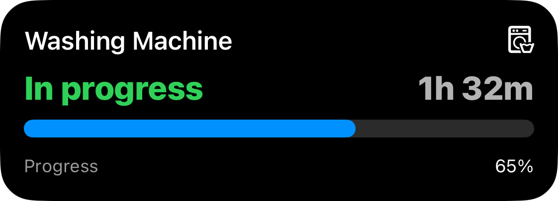
{ "template": "progress", "icon": "washer", "header_left": { "value": "In progress", "text_color": "green" }, "header_right": { "value": "1h 32m" }, "progress": { "style": "simple", "value": 0.65, "color": "blue" }, "footer_left": { "value": "Progress" }, "footer_right": { "value": "65%" }}Segmented bar (layered, with hatched overflow zone):
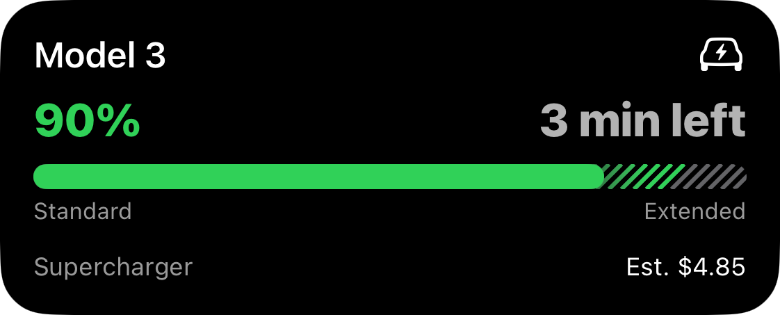
{ "template": "progress", "icon": "bolt.car", "header_left": { "value": "90%", "text_color": "green" }, "header_right": { "value": "3 min left" }, "progress": { "style": "segmented", "value": 0.90, "display": "layered", "segments": [ { "value": 0.8, "fill_color": "green", "track_color": "gray", "label": "Standard" }, { "value": 0.2, "fill_color": "green", "track_color": "gray", "track_fill": "hatched", "label": "Extended" } ] }, "footer_left": { "value": "Supercharger", "text_color": "gray" }, "footer_right": { "value": "Est. $4.85" }, "compact_value": { "value": "90%" }}Monitor Template
Section titled “Monitor Template”ID: monitor
The monitor template is designed for tracking a live status with one or two columns of labeled values.
Home Assistant
Section titled “Home Assistant”Use the Home Assistant quick-start blueprint to post Live Activity updates using the Monitor template.
API schema
Section titled “API schema”| Field | Type | Description | Required? |
|---|---|---|---|
template | "monitor" | Identifies this template. | Yes |
icon | string | Icon | An SF Symbols icon name or an Icon with rendering options. | No |
left_column | Column | Left column payload. | No |
right_column | Column | Right column payload. | No |
primary_column | "left" | "right" | Column emphasized in compact layouts. | No |
tap_url | string | Tap action URL to open when tapped. | No |
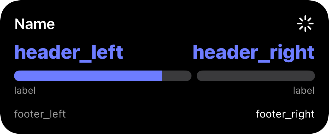
To get a better understanding of how this schema correlates to a displayed live activity, see the picture below:
Column object
Section titled “Column object”| Field | Type | Description | Required? |
|---|---|---|---|
header | string | Short label above the value. | No |
value | Value | Value payload. | Yes |
footer | string | Optional label below the value. | No |
Value object
Section titled “Value object”| Field | Type | Description | Required? |
|---|---|---|---|
value | string | Value to display. | Yes |
text_color | Color | Text color for the value. | No |
formatter | Formatter | Controls how the raw value is displayed. | No |
Color identifiers map to SwiftUI system colors. Swatches below show approximate previews.
| Identifier | Preview |
|---|---|
red | |
orange | |
yellow | |
green | |
mint | |
teal | |
cyan | |
blue | |
indigo | |
purple | |
pink | |
brown | |
gray | |
gray2 | |
gray3 | |
gray4 | |
gray5 | |
gray6 |
Icon object
Section titled “Icon object”When you need more than just a symbol name, pass an object to customize how the
icon is rendered. All fields except name are optional. Omit them to keep the
default appearance.
| Field | Type | Description | Required? |
|---|---|---|---|
name | string | SF Symbol name. | Yes |
rendering_mode | "monochrome" | "hierarchical" | "palette" | "multicolor" | How the symbol’s layers are colored. | No |
primary_color | Color | Primary layer color. | No |
secondary_color | Color | Secondary layer color (palette mode). | No |
tertiary_color | Color | Tertiary layer color (palette mode). | No |
color_rendering | "flat" | "gradient" | Flat fill or vertical gradient. Default: "flat". | No |
Example: palette icon with gradient
{ "icon": { "name": "thermometer.sun", "rendering_mode": "palette", "primary_color": "red", "secondary_color": "orange", "color_rendering": "gradient" }}Passing a plain string ("icon": "thermometer.sun") continues to work and
renders the symbol in monochrome with the default color.
Formatter
Section titled “Formatter”A formatter decides how to display the raw value field. If formatter is
omitted or provided with null, it will display the value as-is without any
transformation.
| Identifier | Description |
|---|---|
time_since | Formats an ISO8601 timestamp as an auto-updating elapsed timer. |
time_until | Formats an ISO8601 timestamp as an auto-updating countdown timer. |
Example payload
Section titled “Example payload”{ "template": "monitor", "icon": "robotic.vacuum.and.ellipsis", "left_column": { "value": { "value": "Mopping", "text_color": "indigo" }, "footer": "In living room" }, "right_column": { "value": { "value": "20.1 m²" }, "footer": "Battery: 87%" }}Preview
Section titled “Preview”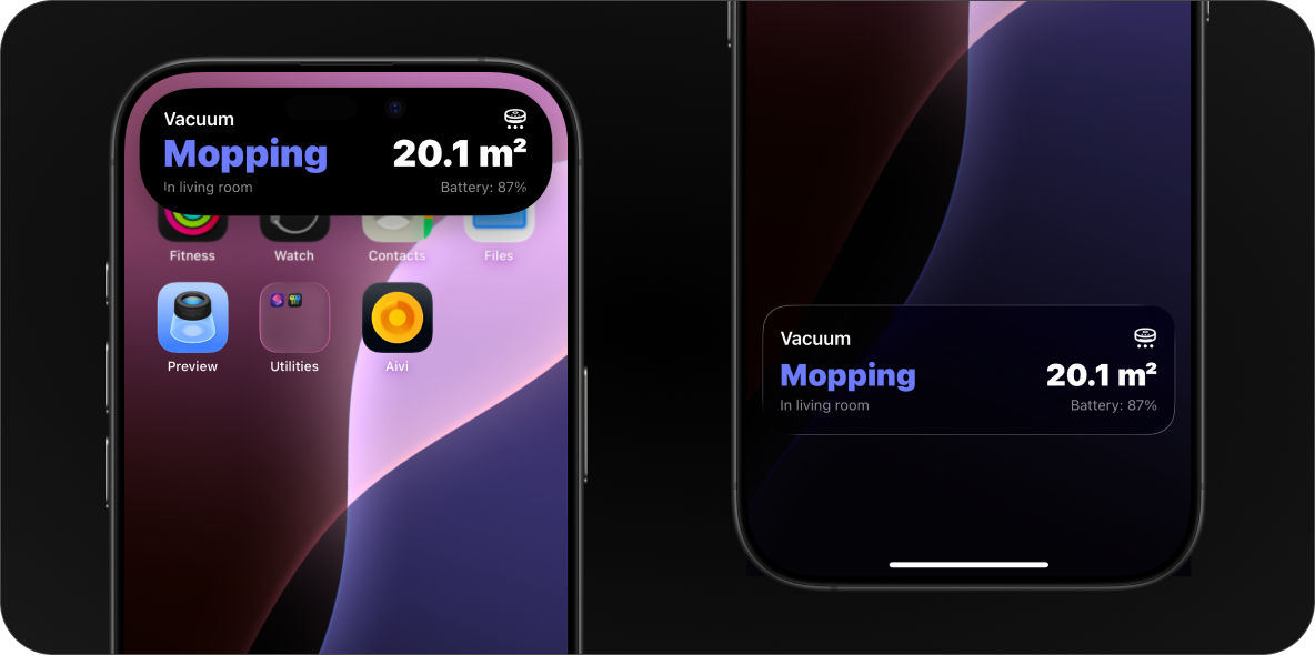
Generic Template Legacy
Section titled “Generic Template ”ID: generic
The generic template works best for simple activities that map cleanly to a progress bar.
Home Assistant
Section titled “Home Assistant”Use the Home Assistant quick-start blueprint to post Live Activity updates using the Generic template.
API schema
Section titled “API schema”| Field | Type | Description | Required? |
|---|---|---|---|
template | "generic" | Identifies this template. | Yes |
progress | float | Progress of the activity in range [0.0-1.0]. | Yes |
state | string | Describes the state of the activity. | No |
icon | string | Icon | An SF Symbols icon name or an Icon with rendering options. | No |
remaining_time | int | Remaining time in seconds. | No |
tap_url | string | Tap action URL to open when tapped. | No |
To get a better understanding of how this schema correlates to a displayed Live Activity, see the picture below:
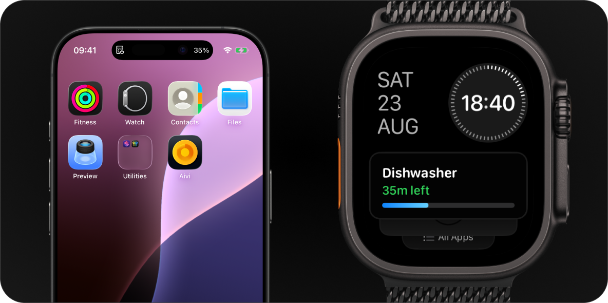
Example payload
Section titled “Example payload”{ "template": "generic", "progress": 0.35, "state": "In progress", "icon": "washer", "remaining_time": 2120}Preview
Section titled “Preview”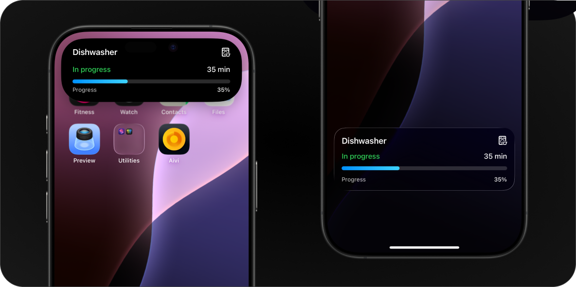
Tap Action URL
Section titled “Tap Action URL”All templates support an optional tap_url field. When set, tapping the Live
Activity on the lock screen or Dynamic Island opens the specified URL instead of
the Aivi app.
This works with any URL scheme the device can handle: regular web links, app deep links, or custom schemes.
Examples
Section titled “Examples”| Use case | tap_url value |
|---|---|
| Open a webpage | https://example.com/status |
| Navigate in Home Assistant | homeassistant://navigate/lovelace/climate |
| Call a HA service | homeassistant://call_service/switch.toggle?entity_id=switch.garage |
| Open another app | myapp://dashboard |
Home Assistant deep links
Section titled “Home Assistant deep links”Home Assistant’s Companion app supports a number of URL schemes for navigating to dashboards, calling services, and more. See the HA Companion docs on URL Handler for the full list.
Finding SF Symbols
Section titled “Finding SF Symbols”To browse the full catalog of available symbols, you can use one of the following apps:
- SF Symbols: Apple’s official app for macOS.
- Interactful: a free third-party SF Symbols browser for iPhone and iPad. Look under Foundations → Iconography.